

If someone one were to say, they think it is very important for a website to be “responsive” what does that mean to you? I can tell you what I thought when I first heard the term “responsive website”.
I had initially thought it meant that the website was fast and had slow loading times. That when I had clicked a button the action would be executed immediately and be able to keep my low attention span from clicking off the website. As it turns out, I was wrong with my assumption and I know I am not the only one who has had this misconception.
Modern smartphones and tablets have revolutionized how developers go about designing websites. According to Google about 50% of all web traffic is done through a mobile device. Designing a website for a smartphone versus a desktop is going to be completely different. We want all of our users to have a good experience when visiting our site. The way we accomplish this with “Responsive Design”. We want our website to respond with how it renders elements based on the size of the device.
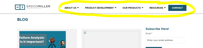
Assuming you are on a traditional desktop monitor/laptop, take look at the navbar on this website -
Now look at what happens when I resize the window to be closer to the size of a smartphone -

The navbar responds to the size of the screen by collapsing the navbar in order to fit on a smaller size. Simply making the navbar smaller with respect to the screen size would not be a good alternative because these links will be used on a touch screen.
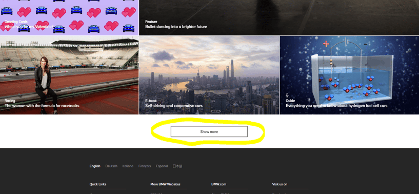
On the topic of keeping links suited for a touch screen let’s take a look at another example. BMW’s website has a button at the bottom of the page near the footer to display more content. Here is how it looks on a large screen -
Now when I resize the screen to the size of an iPad, notice the button actually gets bigger despite the screen being smaller -
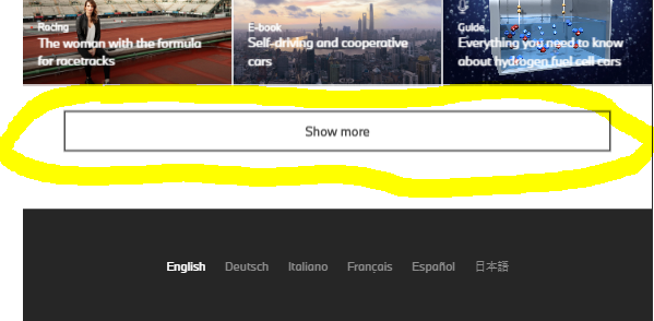
Despite this initially seeming counter-intuitive, remember this is made for a touch screen in mind. So things like buttons can sometimes be better suited to be bigger accounting for a loss of precision when not using a mouse.
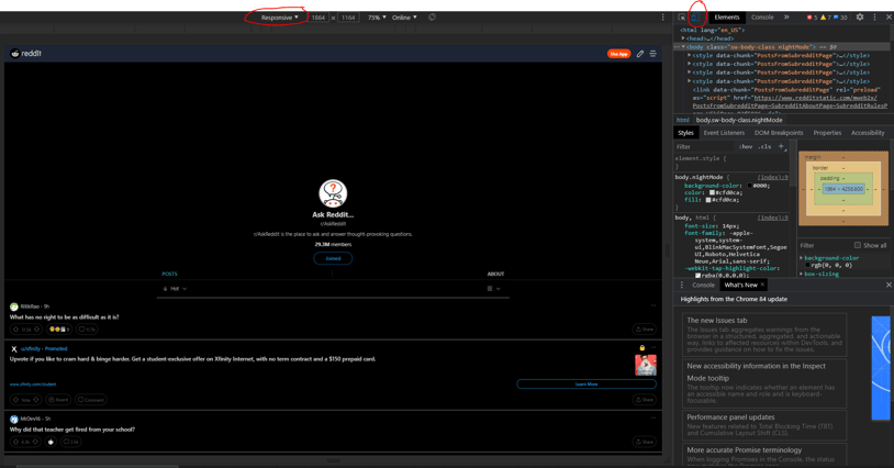
If you are interested in exploring how your favorite websites look on all different devices, google chrome has a neat feature to do so. After loading your favorite website press f12 to open the developer tools. You may then toggle the device toolbar by clicking the icon developer tools. After that you can click the dropdown to select different devices.
If you didn’t already now you understand the basics of responsive design!
